My first bit of information this week is a little graph I stumbled across in part of my weekly readings that represents US corporate profits. When I look at this, it seems perfectly reasonable that the US stock-market is once again nearing record highs:
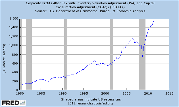
When you see corporate profits are about 33% higher in aggregate than they’ve ever been in history, it stands to reason your stock market should be at all-time highs.
We know from last weeks worse than expected US unemployment figures that the market is not in anything like a frame of mind that could be described as normal. Data showing one month where ‘only’ 120,000 US jobs were created (even after a 4-month frenzy) and the global market starts a serious bout of second-guessing (throwing in some Spanish concerns as well to be fair). The market has been more stable this week and is in my view starting to look ‘through’ the daily cycle of news to feel out what is a reasonably healthy global economy. There are certainly economic issues in every country (to varying degrees) that must be addressed, but I don’t think there is anything outside of a major unforeseen event that should prevent the next couple of years from being better than the historic averages on an economic basis.
I sometimes lament sourcing such graphs as above for Australian equivalent purposes, but even though we are the worlds 13th largest economy (and up to 11th richest on a GDP – PPP basis with our newly strong dollar), we do not seem to do this stuff as well as the US. I’m sure it’s available and I must admit I didn’t try very hard – through the Australian Bureau of Statistics & the Reserve Bank of Australia, we do produce a lot of useful economic data, just not quite as intuitive to locate as the equivalent US information. For example, check out this information packed chart pack from the RBA, I found while trying to locate an Australian corporate profits graph.
Without viewing the actual Australian graphical equivalent, I would guess that our corporate profits chart would be shaped reasonably similarly to the US graph above, perhaps with a shallower dip through the GFC and a less explosive rise out of the bottom. Yet as I pointed out a couple of weeks back, our markets are about 2/3 of their all-time highs, while the US looks like testing theirs soon enough – we Aussies are a pessimistic lot…
Finally, I wanted to link out to a High-School student economics blogger I’ve been in the habit of reading regularly over the last month or so. Evan Soltas is his name, you should do yourself a favour and review his blog here regularly, it soothes my soul to know such serious (and intelligent) youngsters are out there in the world. I live with one too in my 18 year-old son, but unfortunately, though he’s a student Economist/Philosopher and a sound thinker, he’s not a blogger. This post in particular was impressive, the last graph points to just how seriously the deleveraging process has been taken by US corporates – we just need the worlds governments to take the same steps when things return to something like ‘normal’ – Tony Hansen 13/04/12.
|
|
April 1st 2011 |
Jan 1st 2012 |
Current Price |
Current Period |
Since Inception |
|
EGP Fund No. 1 |
1.00000 |
0.96254 |
1.03914 |
7.96% |
3.91% |
|
35632.05 |
30879.12 |
33383.59 |
8.11% |
(6.31%) |
EGP Fund No. 1 Pty Ltd. Up by 7.96%, lagging the benchmark by 0.15% since January 1st. Since inception, EGP Fund No. 1 Pty Ltd is Up by 3.91%, leading the benchmark by 10.22% all-time (April 1st 2011).